CLÍNICA ALÍVIO DA DOR.
From pain to relief. An identity shaped by care.
What began as a request for a logo evolved into a visual identity grounded in concept, semiotics and brand language. The sections below follow the original project presentation.
A first encounter with the identity.
The logo reflects the clinic’s approach to care: welcoming people and helping them move toward relief.
A journey from pain to relief.
The mark’s upward movement expresses the transformation that care can bring. The identity communicates warmth, reassurance and a more human experience.
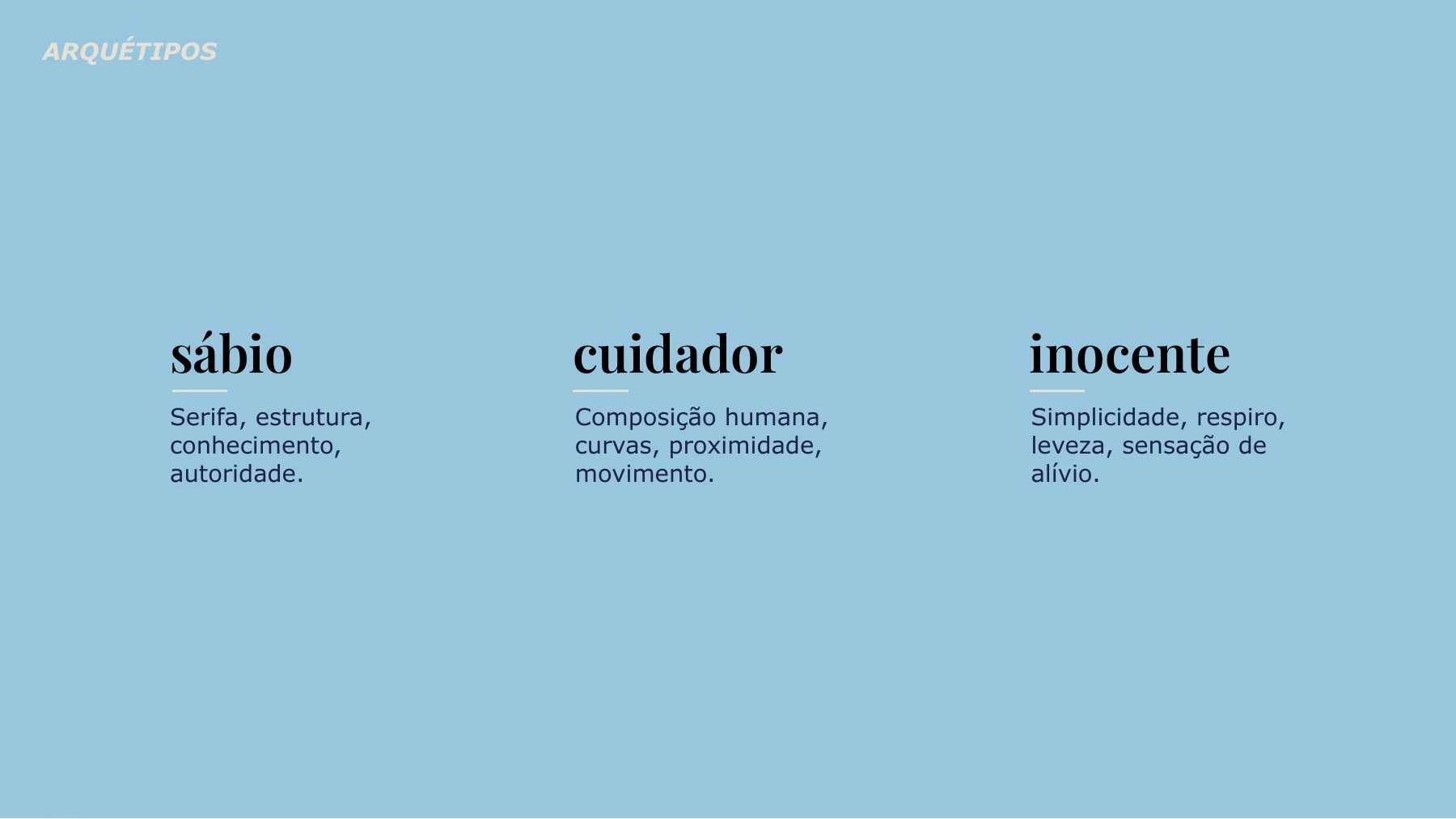
The Sage, the Caregiver and the Innocent.
The Sage comes through in structure and knowledge, the Caregiver in a warm, approachable composition, and the Innocent in simplicity, open space and a sense of relief.
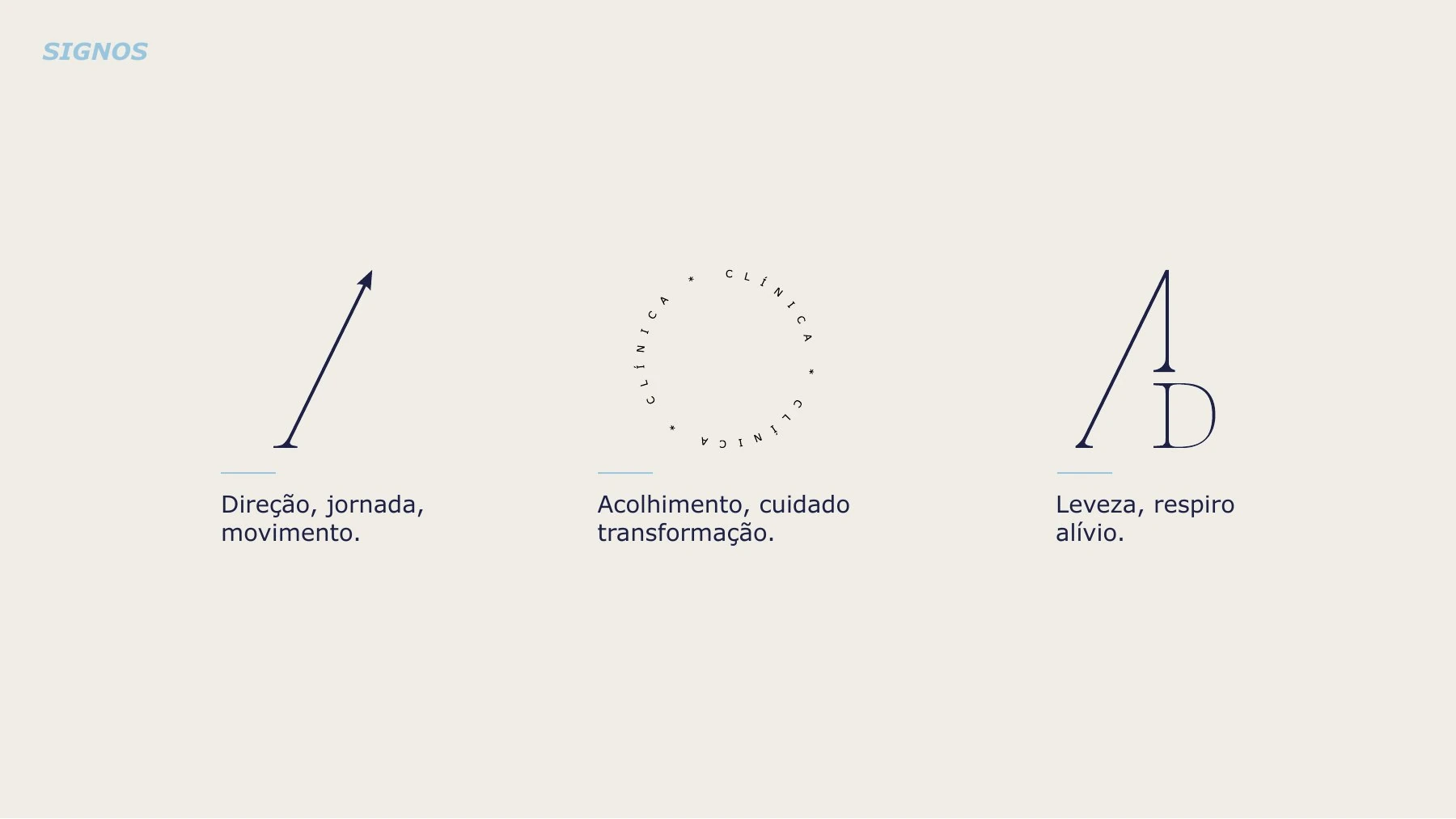
Direction, warmth and lightness.
The signs evoke direction and movement, warmth and transformation, and the lightness and breathing room that come with relief.
A consistent visual language.
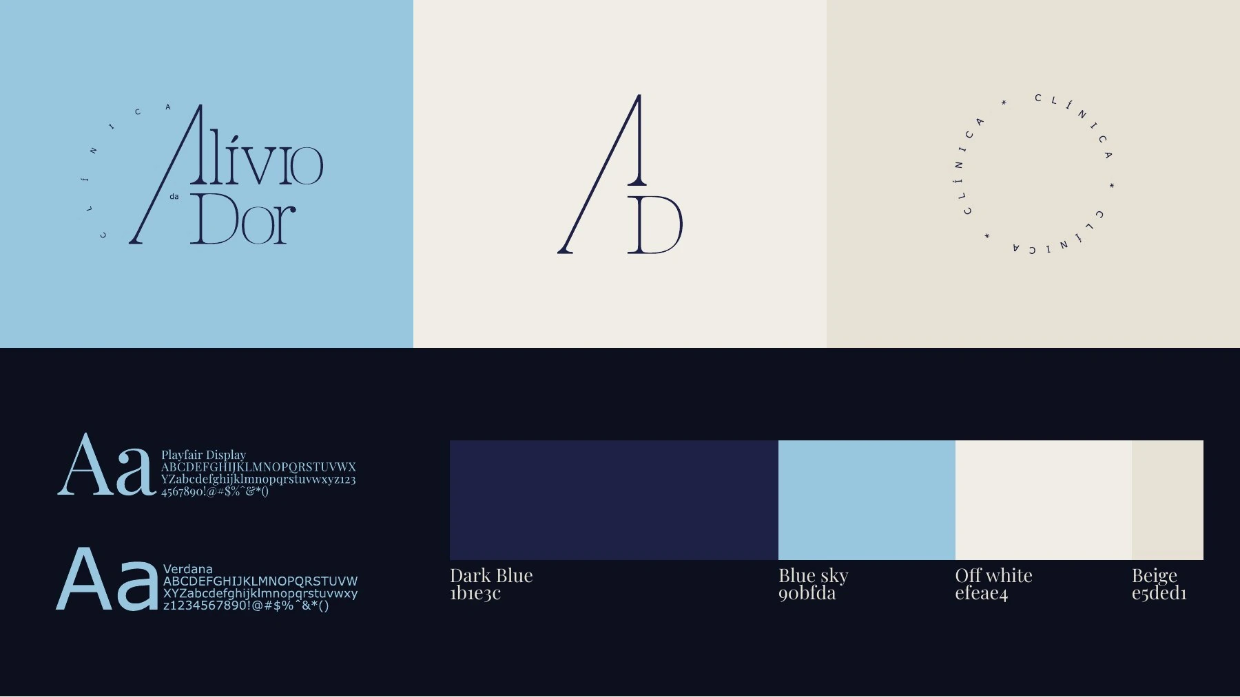
The presentation shows how the mark was built and brings together logo variations, typography and a palette of dark blue, light blue, off-white and beige.
The identity across touchpoints.
The mockups show how the visual system extends to the materials the clinic uses to communicate with patients.